Exclusive to Atfarm
Meet Atfarm's new feature
The N-Uptake map
The first map in the market that estimates total nitrogen uptake on your field.
Exclusive to Atfarm
Meet the new
N-Uptake map
The first map in the market that estimates total nitrogen uptake on your field.
Exclusive to Atfarm on desktop
Explore the new N-Uptake map



Exclusive to Atfarm on desktop
Explore the new
N-Uptake map:

THE NEWEST MAP VIEW
What is Atfarm's N-Uptake map?
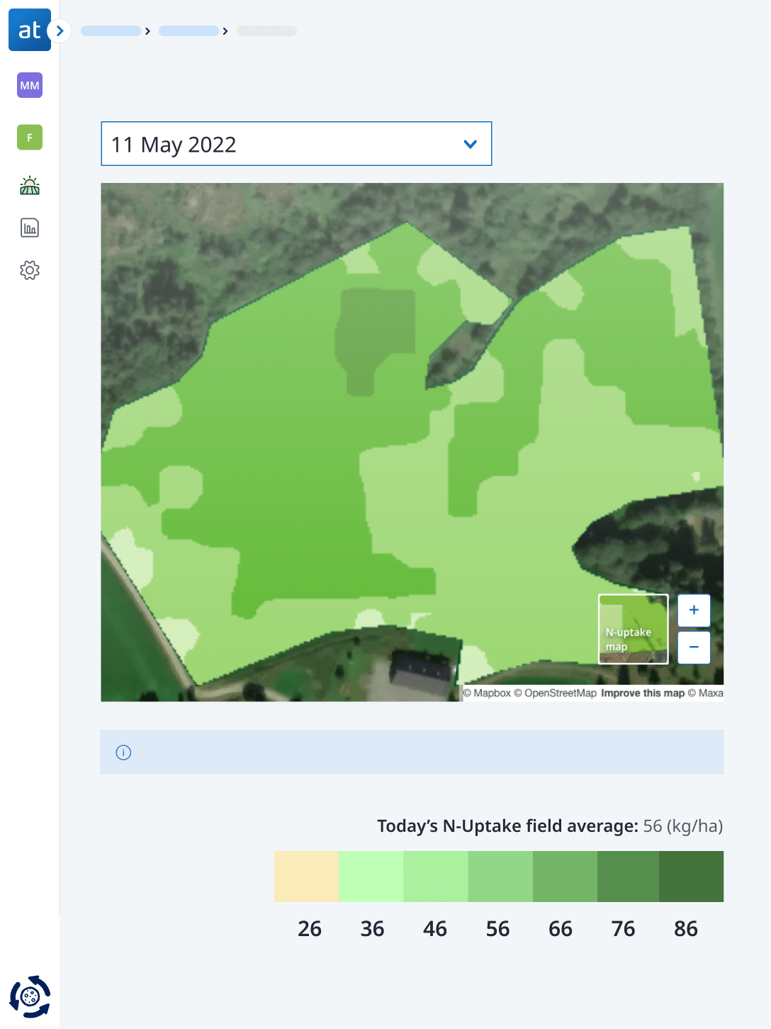
The N-Uptake is the newest map view in Atfarm. This map shows you the total nitrogen (N) your crops have absorbed so far in kilos of N per hectare.
We created this new map to help you:
- Monitor nitrogen uptake in kilos per hectare
- Easily check your fields remotely
- Make the most of each field visit
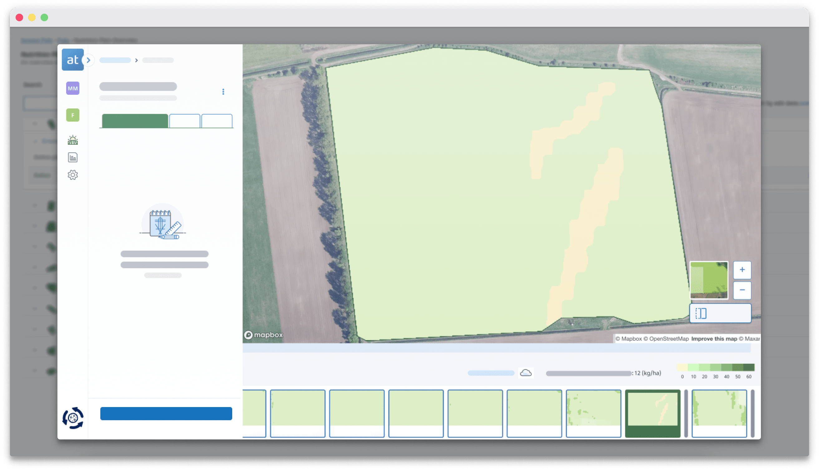
Do you know how much N your crops have absorbed this season?
See an N-Uptake map of your field on your computer in 3 steps:
See the variability in your fields with the Atfarm app
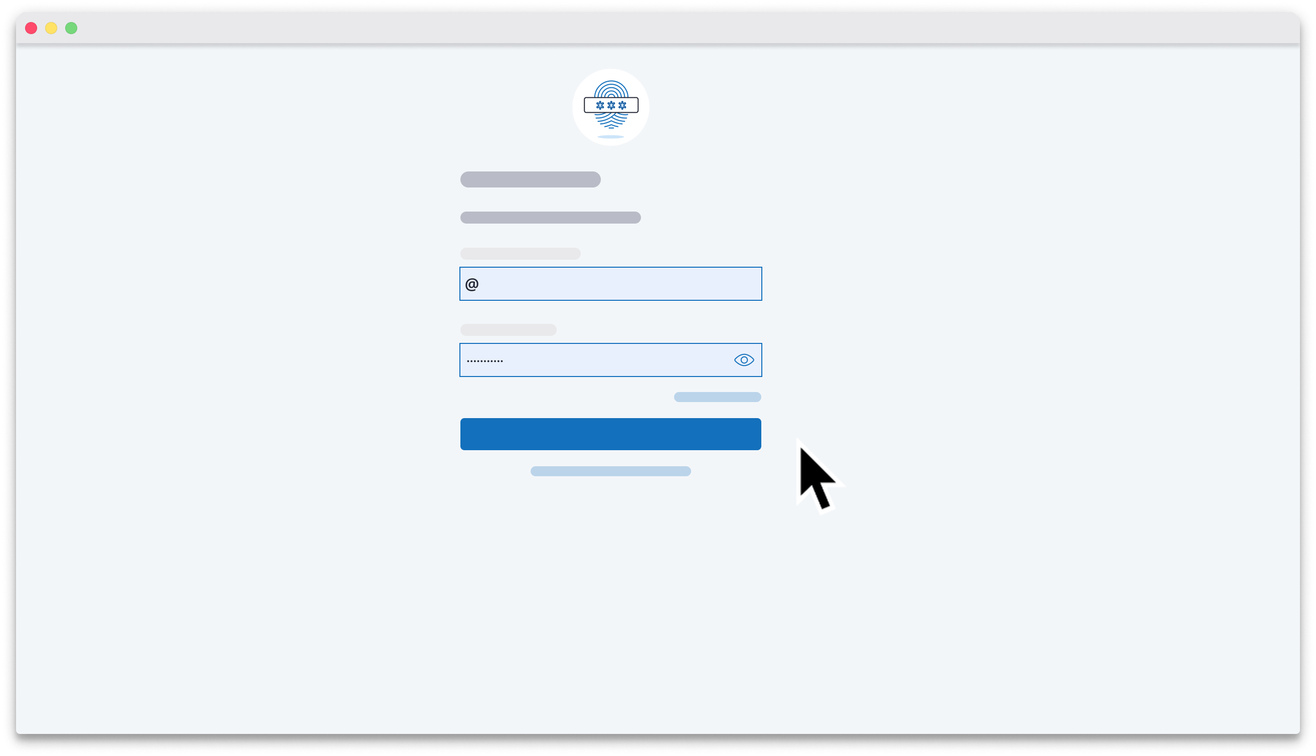
Log in to Atfarm
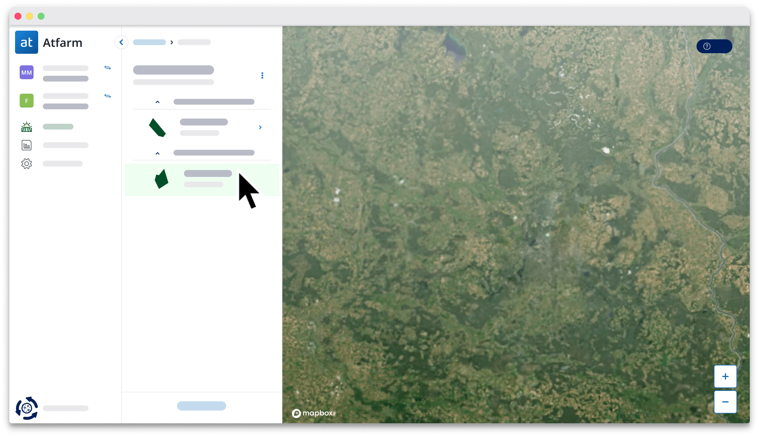
Select your field
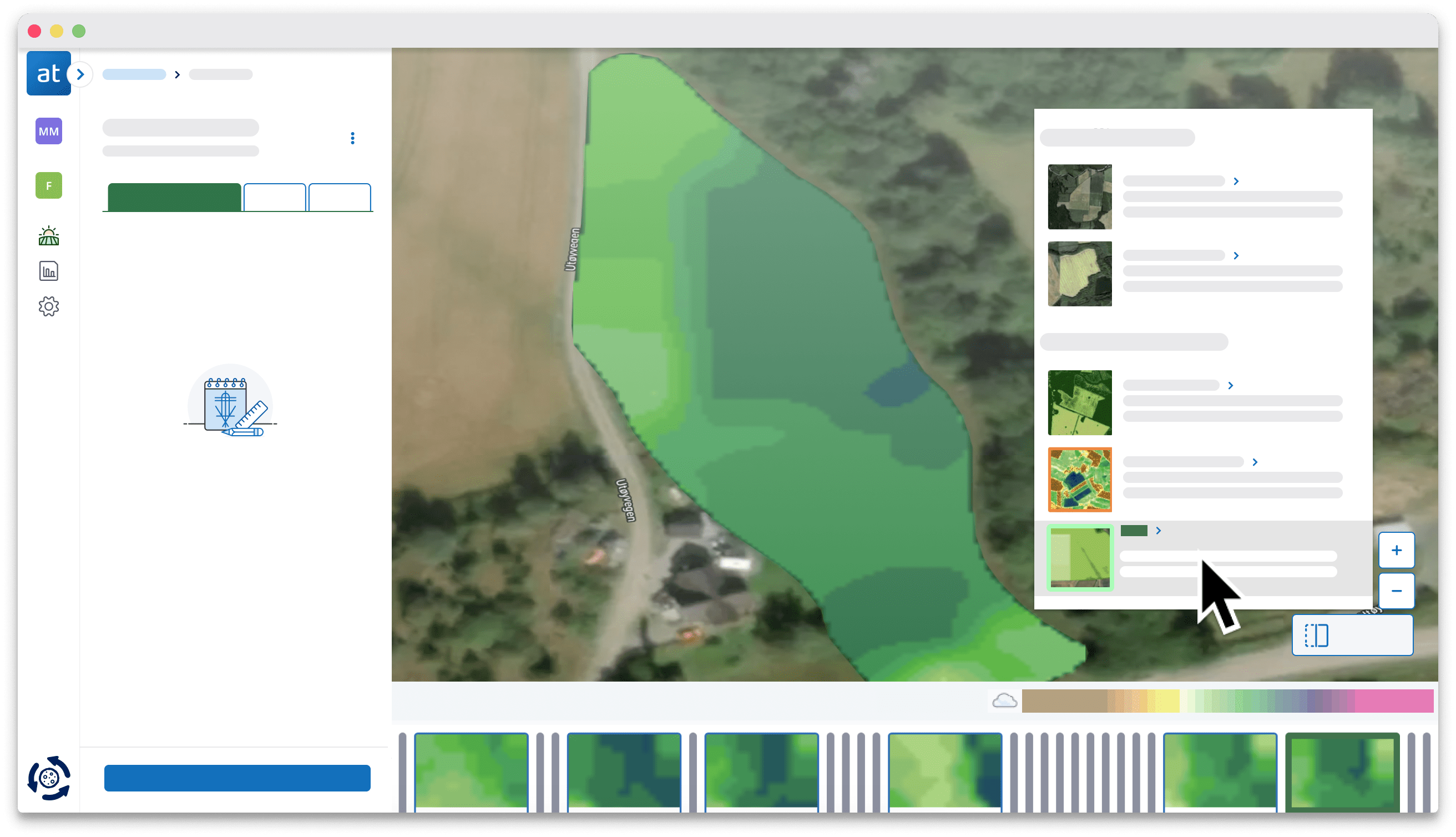
Change your map view from Optimised map to N-Uptake
See the variability in your fields with the Atfarm app
See the variability in your fields with the Atfarm app
THE NEWEST MAP VIEW
What is Atfarm's N-Uptake map?
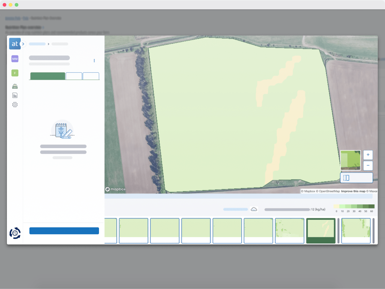
The N-Uptake is the newest view in Atfarm.
You can see estimates of the total nitrogen (N) your crops have absorbed so far in kilos of N per hectare.
We created this new map type to help you:
- Monitor nitrogen uptake in kilos per hectare
- Easily check your fields remotely
- Make the most of each field visit
N-uptake in kilos per hectAre from your COMPUTER
How much N have your crops absorbed?
Find out with an N-Uptake map of your field in 3 steps.

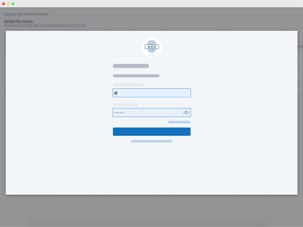
Log in to Atfarm:
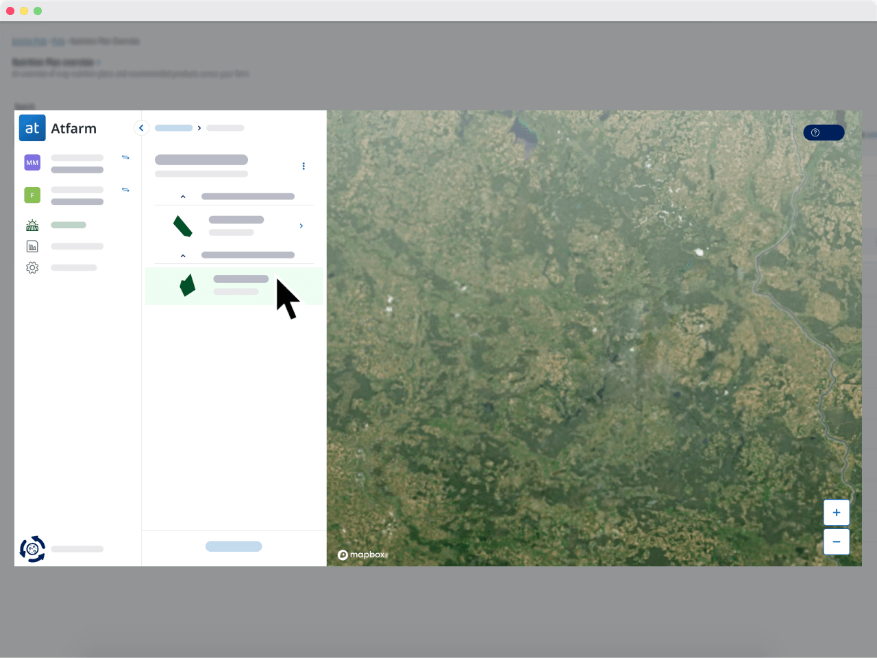
Select your field:
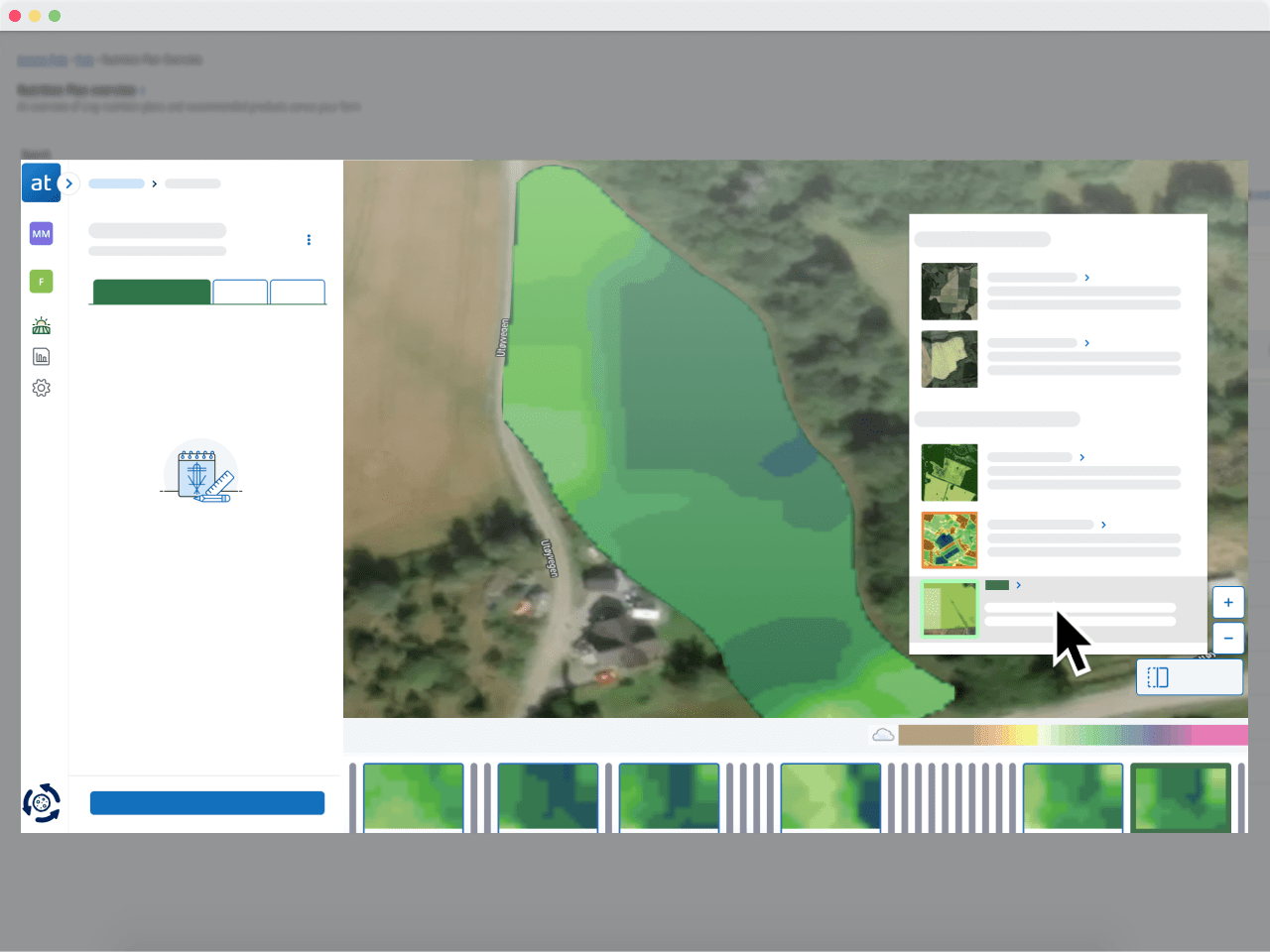
Change your map view from Optimised map to N-Uptake:
N-Uptake - A MAP TO MONITOR NITROGEN EFFICIENCY
What Yara Agronomists have to say about it
"We created the N-Uptake map view in Atfarm to help farmers monitor their fields remotely. The N-Uptake map also enables farmers to make the most of each field visit or even minimise their field visits each season while allowing them to more accurately predict yield."
Mykola, Yara Agronomist

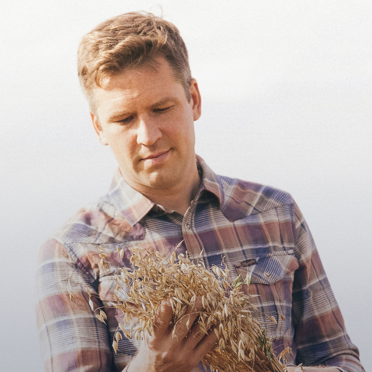
"Atfarm's N-Uptake map allows farmers to see the accumulated N uptake with different colours throughout the entire development of the crop up until senescence when nutrients in the leaves move to the grain and the crop turns from green to yellow.
This map view was created after years of research by Yara Agronomy Research & Development (YARD). It is the result of studied correlation between field samples and laboratory measurements on N-uptake at given growth stages for various crop types."
Marco, Senior Manager of Scalable Agri-Technology
N-UPTAKE - A MAP TO MONITOR NITROGEN EFFICIENCY
What Yara Agronomists have to say about it

"We created the N-Uptake map view in Atfarm to help farmers monitor their fields remotely. The N-Uptake map also enables farmers to make the most of each field visit or even minimise their field visits each season while allowing them to more accurately predict yield."
Mykola, Yara Agronomist
N-Uptake - A MAP CREATED AFTER YEARS OF RESEARCH
Currently calibrated for these crops:
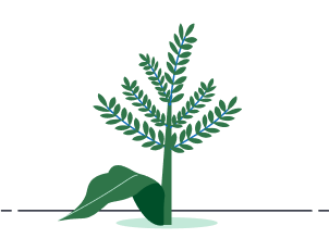

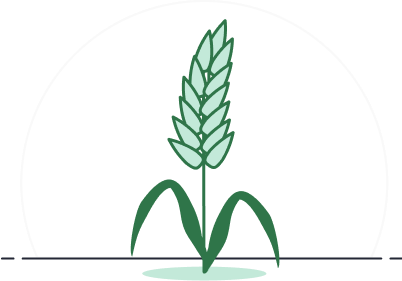

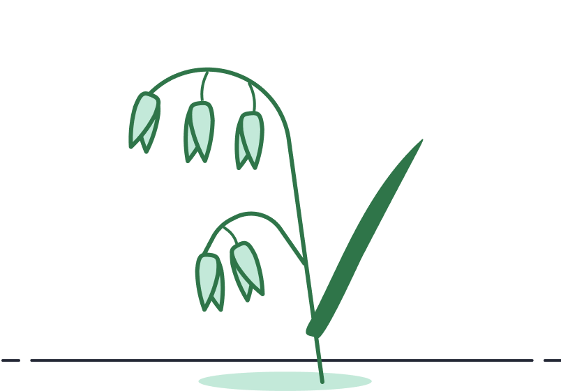
Maize
Potatoes
Cereals
Sugarcane
Oats
Grassland
Get a view of your crops beyond what your own eyes can see!
What happens on the ground?
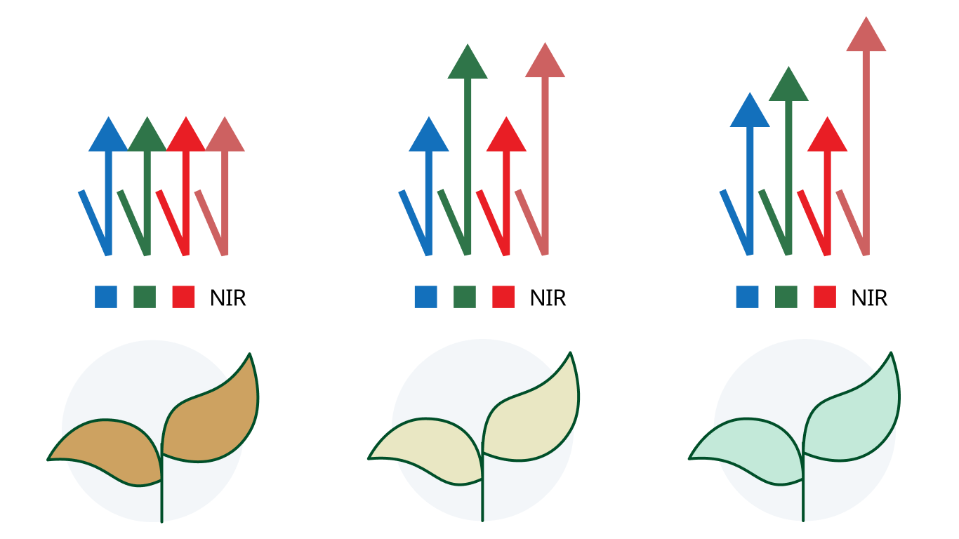
Atfarm’s Crop Monitoring uses infrared and red edge wavelengths to show you things about the health of your crops that aren’t visible to the human eye.
The Red Edge and Healthy Photosynthesis
The wavelengths in the infrared spectrum are invisible to the human eye but are crucial when it comes to determining crop health.
On average, very healthy crops will have more activity in the visible red and invisible infrared light spectrums. This range is called the red edge of light.
Images that capture details of the red edge give deeper insights into the true health of a crop and can highlight abnormalities that other images may miss.
Luckily, Sentinel-2 are the first satellites of their kind to be able to capture and transmit data on this range of light.
N-UPTAKE - CREATED AFTER YEARS OF RESEARCH
Currently calibrated for these crops:
Maize
Potatoes
Cereals
Sugarcane
Oats
Grassland
N-Uptake - NITROGEN UPTAKE IN KILOS OF N PER HECTARE
Understand the dynamic N scale
See the variability in your fields with the Atfarm app
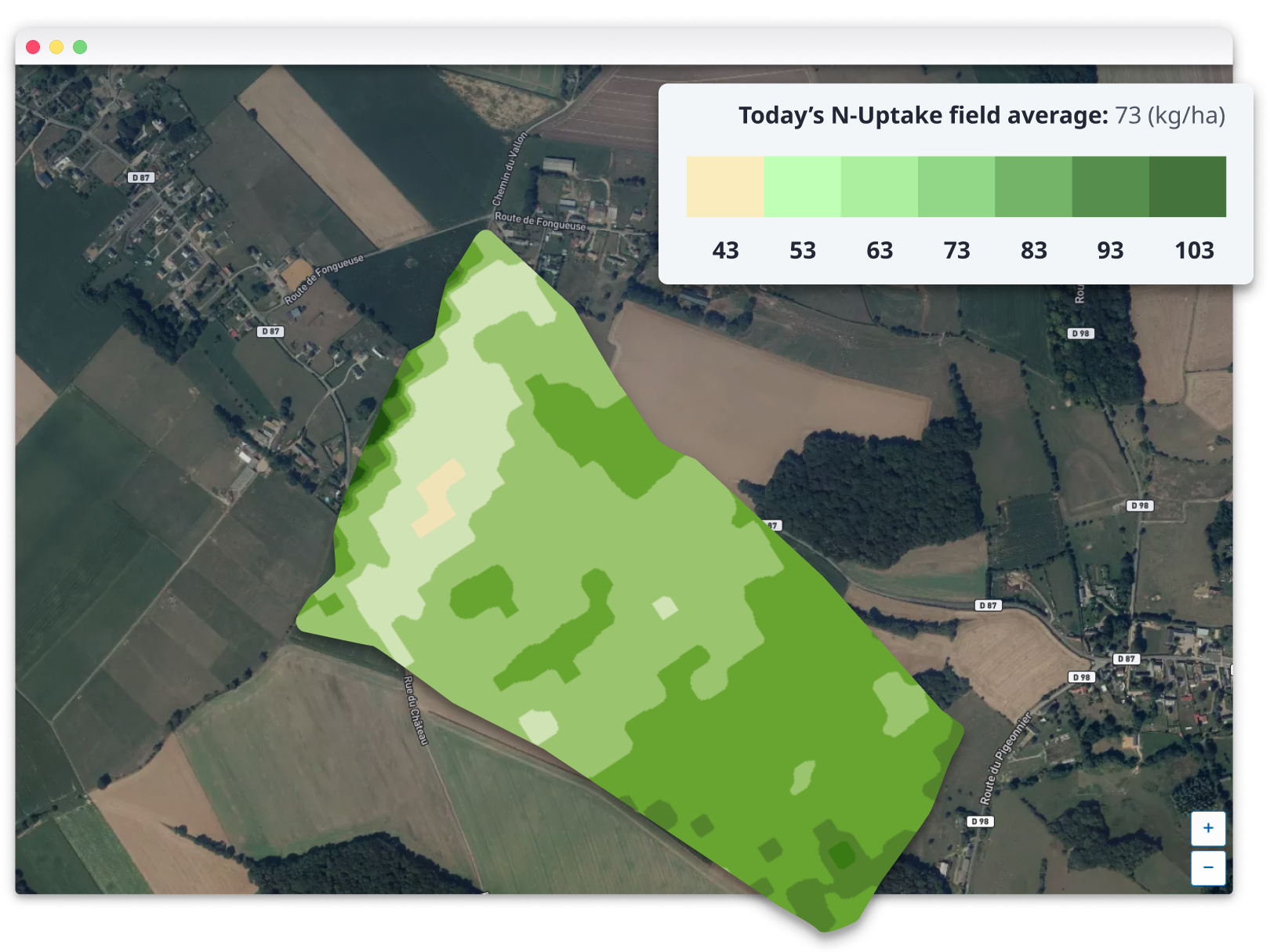
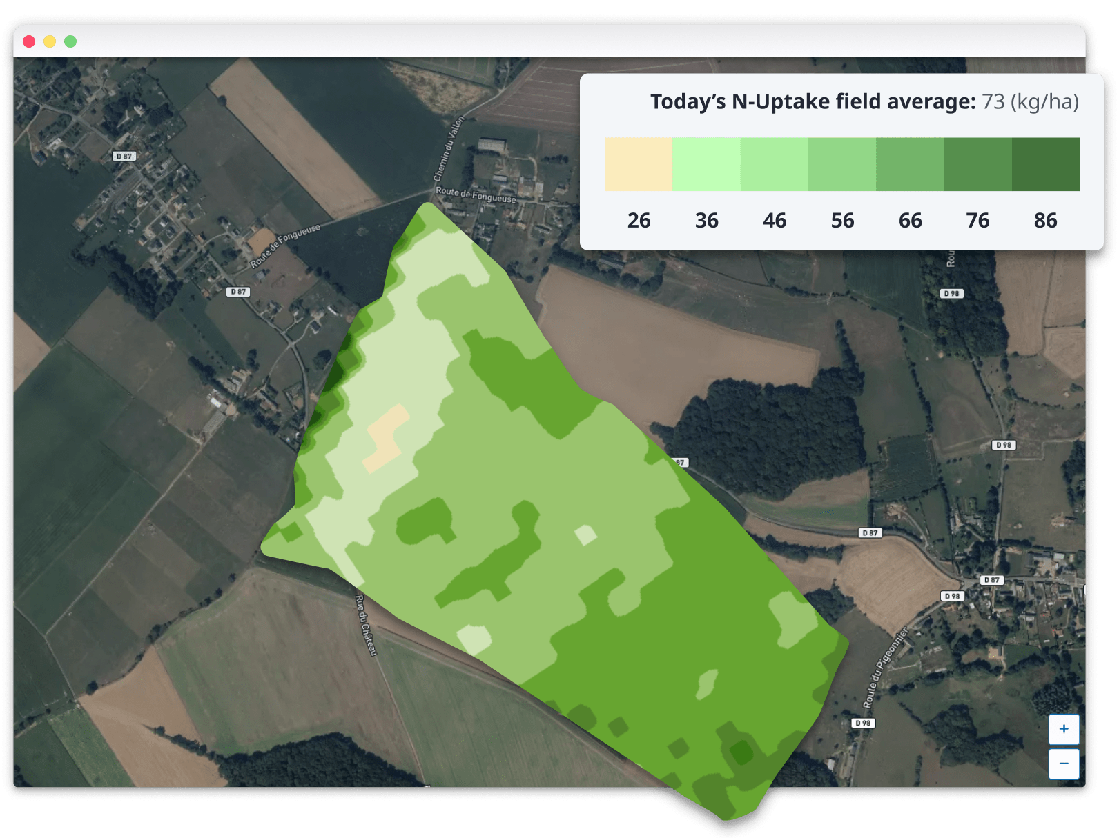
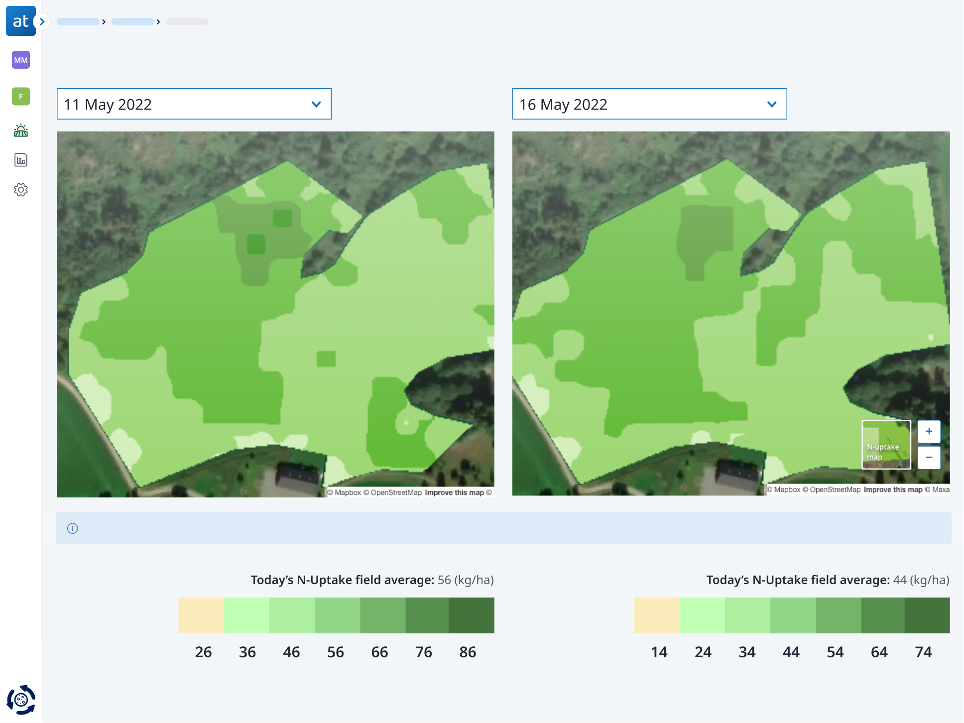
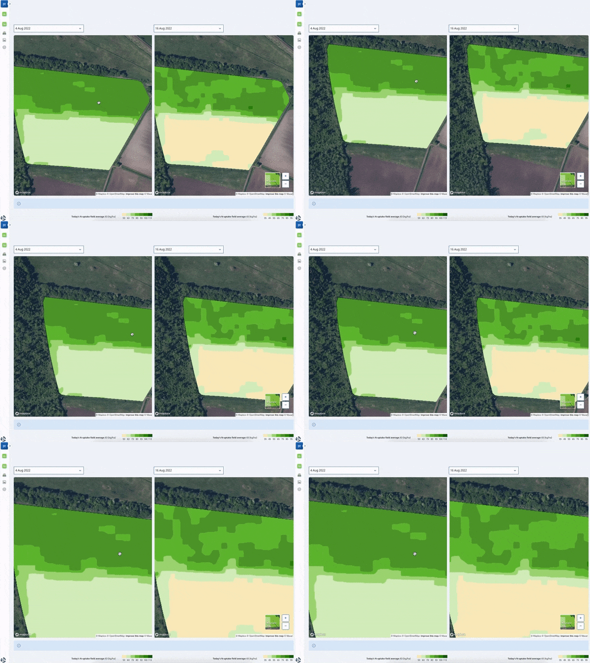
Each N-Uptake map in Atfarm uses the same colour scale from light yellow to dark green. These colours represent the average N-Uptake in kilos per hectare across the field.
The lightest yellow areas are 30 kilos lower than the field average while the darkest green are 30 kilos more than the average.
This is to help you quickly identify the areas of low or high N-Uptake on each field in kilos of N per hectare.
N-Uptake map in biomass comparison mode - Available on desktop.
N-UPTAKE IN KILOS OF N PER HECTARE
Understand the dynamic N scale
Each N-Uptake map in Atfarm uses the same colour scale from light yellow to dark green. These colours represent the average N-Uptake in kilos per hectare across the field.
The lightest yellow areas are 30 kilos lower than the field average while the darkest green are 30 kilos more than the average.
The lightest yellow areas are 30 kilos lower than the field average while the darkest green are 30 kilos more than the average.
See the variability in your fields with the Atfarm app
N-UPTAKE - VISUALISE THE REAL NITROGEN UPTAKE
Why a "dynamic" scale?
See the variability in your fields with the Atfarm app
This colour grading is the same in each map so you can easily compare the variability of N-Uptake between fields and specific dates.
The standard colour range also means each map is easy to understand without using hundreds of shades of yellow or green to cover each value of kilos per hectare that is possible for a crop during a season.
Explore the N-Uptake maps of your fields in Atfarm's comparison mode to fully understand how the dynamic scale works.
VISUALISE THE REAL NITROGEN UPTAKE
Why a "dynamic" scale?
Why a "dynamic" scale?